00
DCB Market
DCB Market is a B2B commerce marketplace developed for a leading banking institution. It empowers over 200 business partners—from small local shops to large retailers—to seamlessly sell products on a centralized platform.
started with…
I joined the project at its inception and worked as a UI/UX Designer for over 2.5 years, overseeing the product’s design evolution from a small pilot to a robust, scalable solution.
The Challenge
Partner businesses were previously using multiple external sales platforms, leading to:
Operational inefficiencies
Scattered product and inventory data
Inconsistent customer service experiences
Inability to offer integrated credit financing
This fragmented ecosystem hindered growth, transparency, and customer satisfaction. The bank needed a unified solution that streamlined partner operations while offering new value to end users.
Before DCB Market, partner vendors relied on outdated methods: some manually tracked orders in spreadsheets, others used social media pages. As one partner put it, “we’re spending more time managing tools than selling products.”
My Role
I was one of the earliest contributors to the project, serving as the primary UI/UX Designer. My responsibilities included:
Conducting stakeholder interviews and user research
Designing core features and user flows in Figma
Creating interactive prototypes and high-fidelity UI
Iterating on feedback from partners and internal teams
Collaborating closely with product and development teams to ensure feasibility and consistency
Key Features
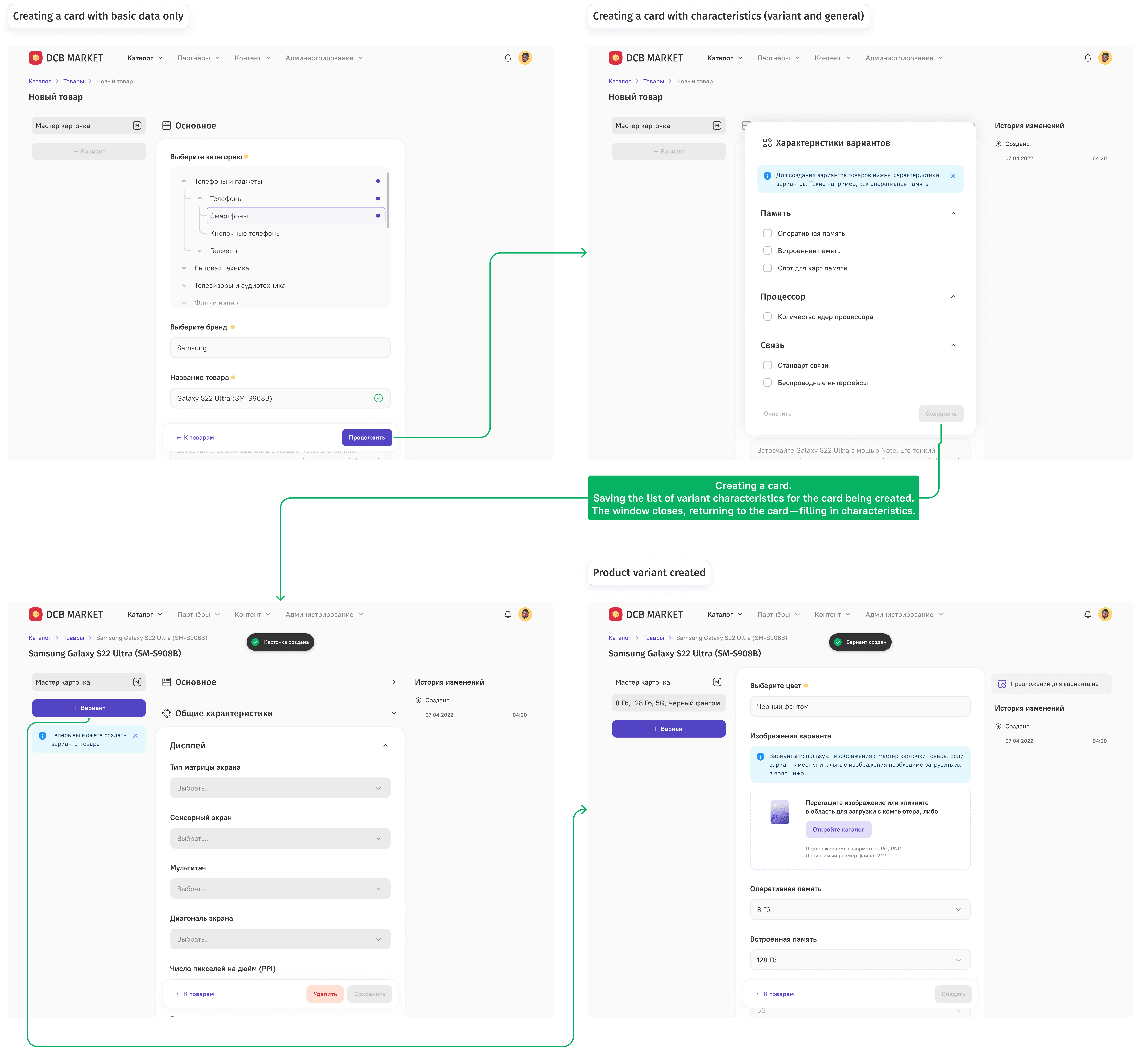
Catalog > Adding a new product
In early testing, partners consistently struggled to list products—especially when those products had multiple variants. One partner described the process as “tedious and repetitive,” often leading to missed fields, duplicate entries, or manual errors.
To solve this, I designed a guided product entry flow that simplifies listing a product step by step. The goal was to reduce errors and increase confidence, even for non-technical users.
Key Improvements:
Streamlined product + variant creation with smart form logic
Inline editing + bulk updates to speed up catalog management
Search and filters to quickly locate and organize large inventories
This approach significantly reduced onboarding time for new partners and made adding products feel faster and more intuitive.

on the screen
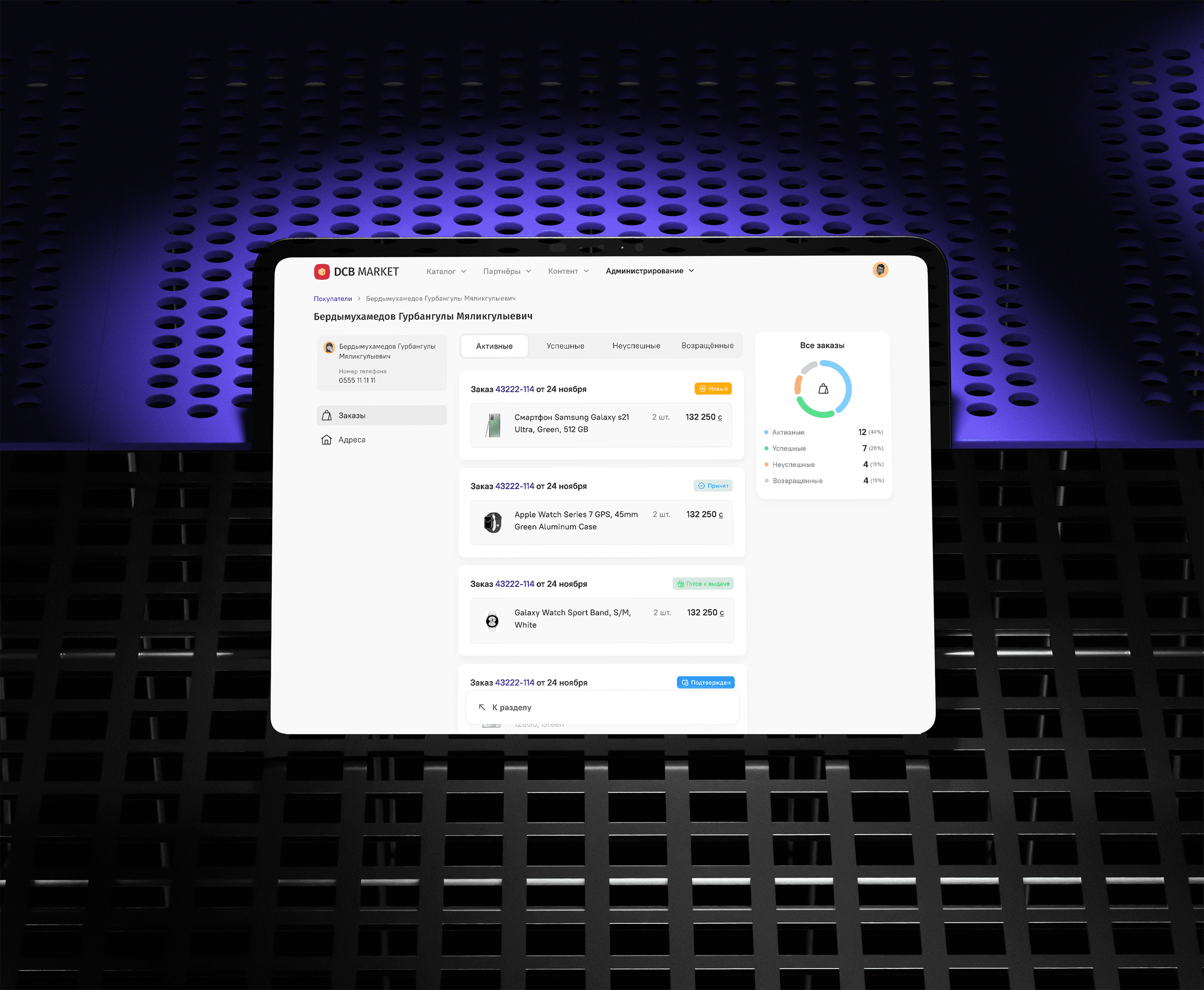
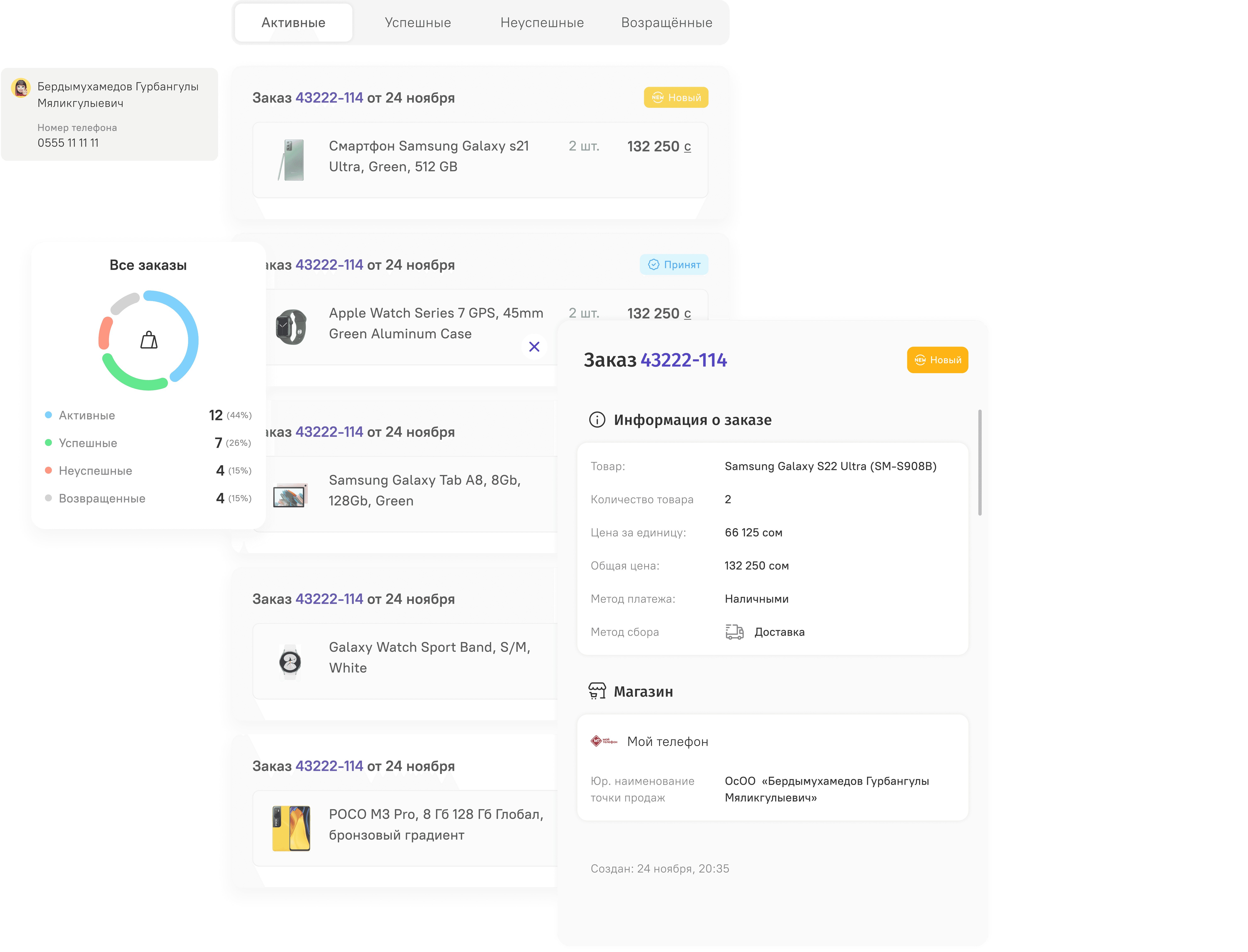
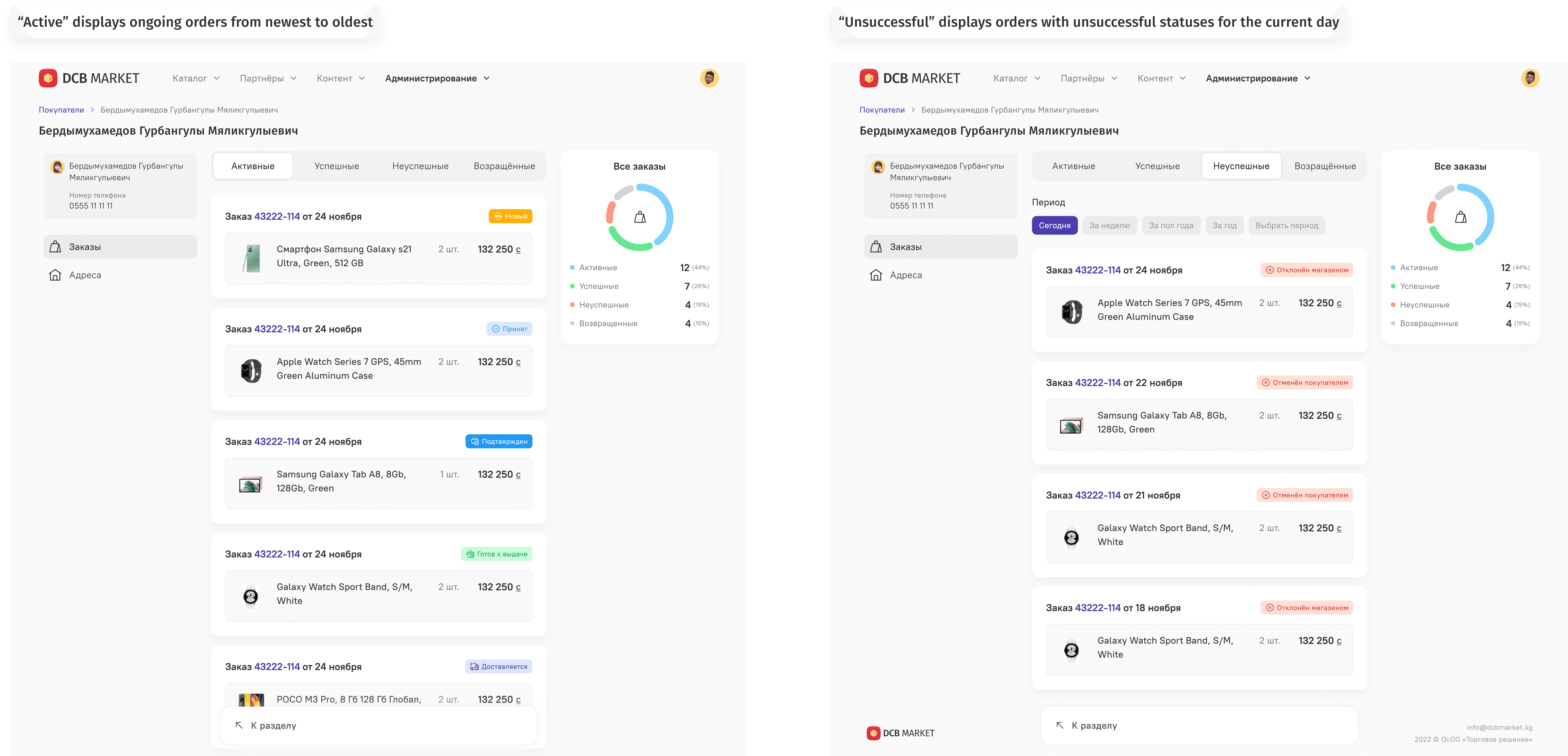
Admin Panel > Customers
Before DCB Market, the operations team struggled to understand what was happening on the platform in real time. Sales data was scattered across spreadsheets and manual reports. This slowed down daily decision-making and made it difficult to identify issues like failed transactions or delayed deliveries.
“We were spending hours just trying to figure out which orders were stuck.” — Internal operations team member
To solve this, I collaborated closely with the operations and product teams to co-design a centralized admin dashboard. Our goal: surface only the most actionable data first, and make the interface fast and intuitive for daily use.
Key Features:
Live order statuses with smart labels for active, failed, returned
Drill-down views to access full order and customer histories in one click
Visual analytics to spot daily trends, top-selling products, and operational bottlenecks
After launch, admins reported resolving order issues 2x faster and felt more confident in their day-to-day oversight.
This dashboard became the operational nerve center of the platform — empowering quick decisions and boosting internal efficiency.
on the screen

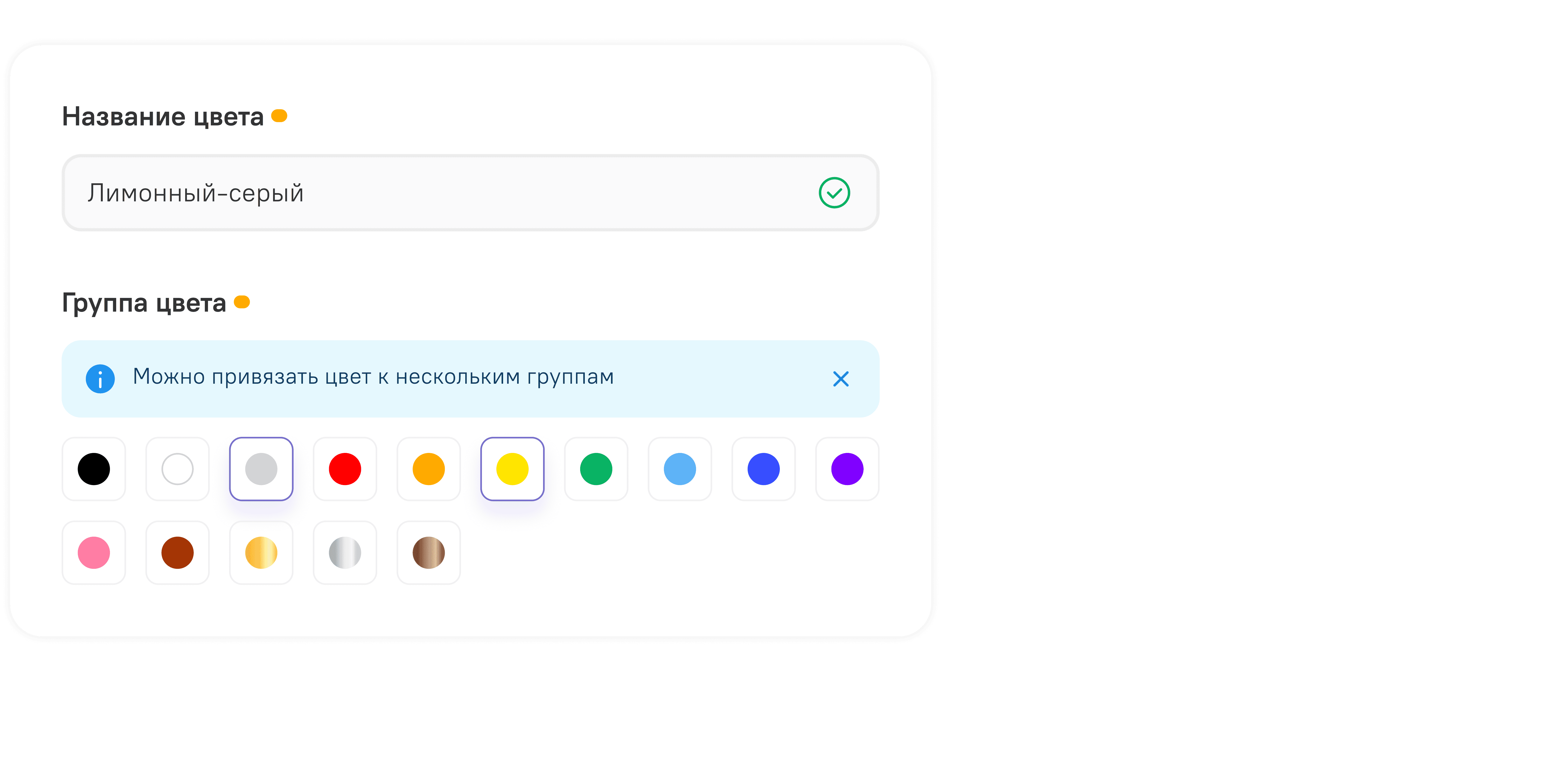
Catalog > Product Colors
As the marketplace expanded, partners began uploading more complex items—clothing in multiple sizes and colors, electronics in different configurations. The original interface couldn’t handle this well: color selections were overwhelming, and multi-colored items weren’t represented correctly.
To improve this, I designed a flexible and visual variant system that lets partners manage complexity without confusion.
Key Features:
Grouped attributes (e.g., color + size) to reduce visual clutter
Dual-color display with swatches for mixed-tone products
Per-variant image uploads so customers always see what they’re selecting
The new system made it much easier for both sellers and customers to navigate and trust product options, especially for high-variety catalogs.
on the screen

Results & Impact
Grew from 6 pilot vendors to over 200 active partners
Onboarding time for new partners dropped from 2 weeks to 3 days
Reduced product listing errors by 40% after introducing structured variant forms
Enabled real-time monitoring via the admin panel
Reflections
DCB Market has given me the rare opportunity to be part of a team developing a complex product over a long period. I have gained deep experience in:
Enterprise product design
Long-term iterative design methods
Collaboration between business, technology and finance
This example demonstrates how thoughtful UX can bridge the gap between business needs and user goals, ultimately delivering a product that is both functional and effective.
Note: Integrated credit financing is a planned future enhancement.
01

Brand Management Screen — A clean, intuitive interface for managing partner brands. Built-in filters by country, status, and logo presence allow admins to quickly search, edit, or deactivate brands with ease. This tool streamlines daily operations as the number of partners scales.
02

Product Catalog Screen — A streamlined interface that enables administrators to efficiently browse, search, and manage product listings. Key actions like editing, activating, or deactivating items are accessible directly from the table, reducing friction in daily catalog operations.
03

Product Variant Creation Screen — A user-friendly interface for configuring product variants. Admins can easily assign colors, upload specific images, and manage attributes like memory or size, streamlining the setup of complex product offerings.
see also