00
Design System for the DCB
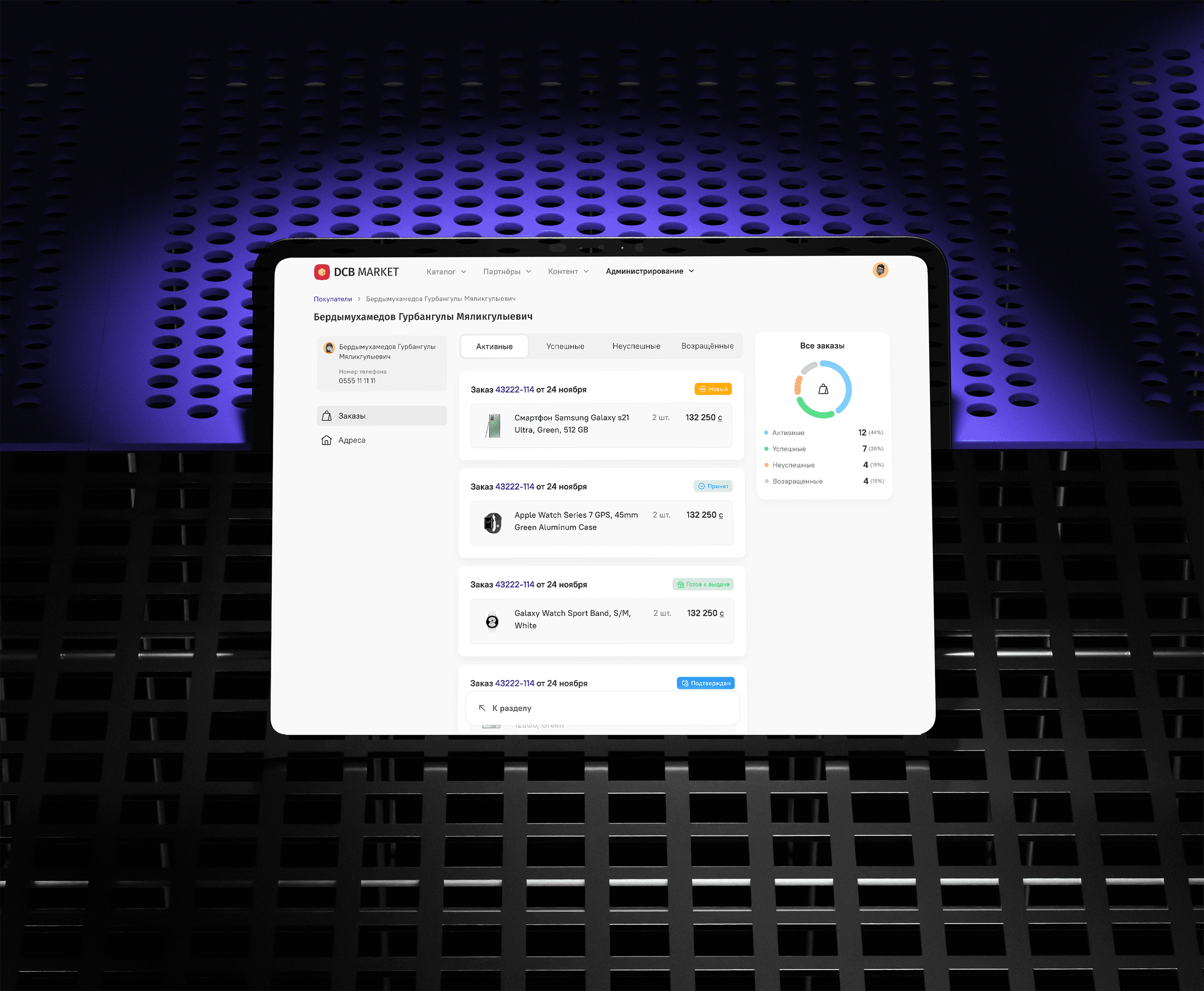
DCB Market is a global marketplace with three key products: a web storefront, a mobile site, and an internal admin panel. I created a design system for the admin panel so these back-office tools could match the polish and efficiency users already enjoy on the storefront.
/01
Problem
DCB Market needed one consistent look for its web storefront, mobile experience, and internal admin panel. Each product was designed independently, which led to mismatched elements, repeated work, and a fragmented user journey. My task was to develop a flexible, scalable design ecosystem that would bring all DCB products under one unified style.
/02
Solution
I built a design system that centralized colors, typography, and core UI elements. Since each product had distinct needs, the system broke into three collections:
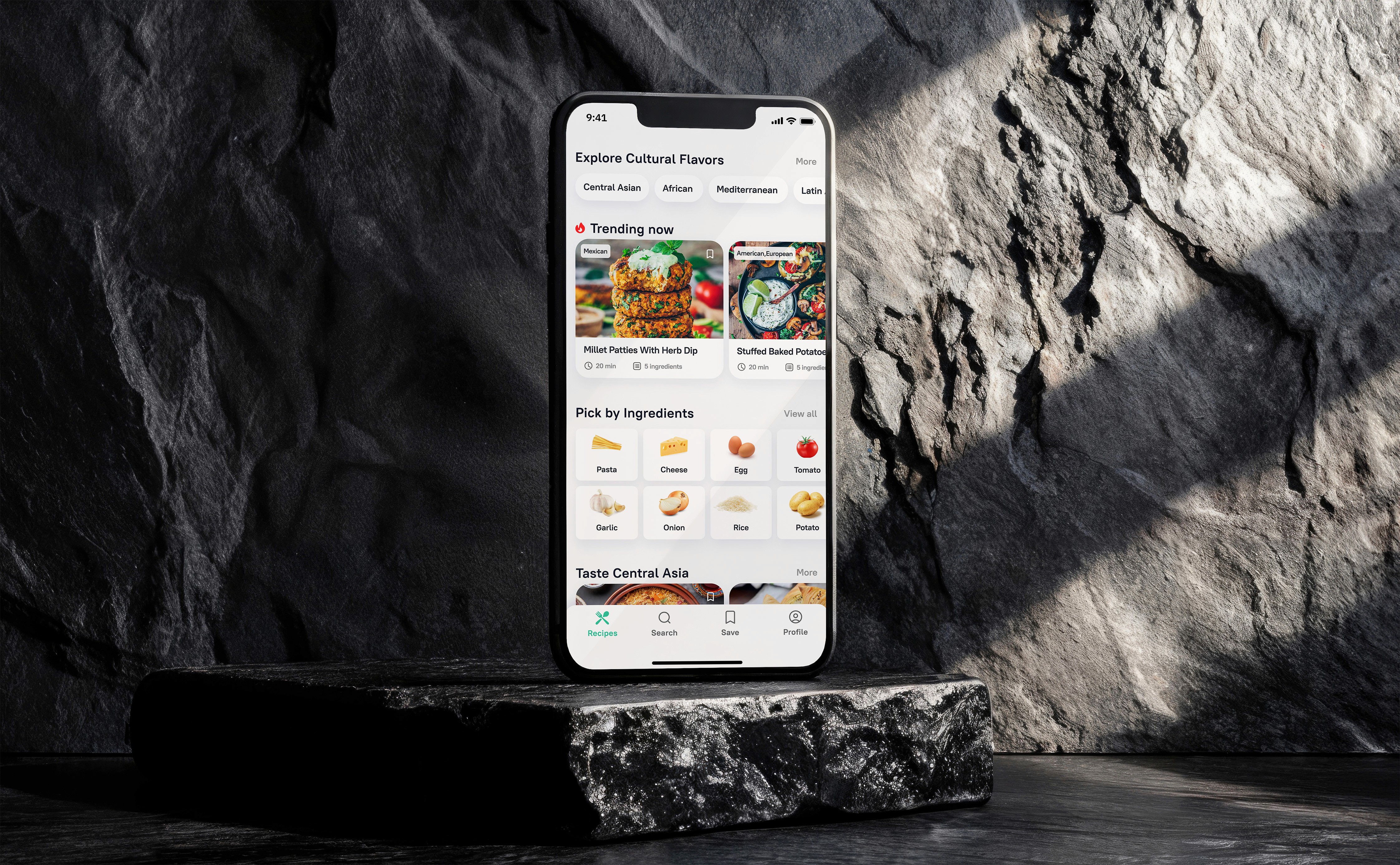
Banking Mobile App
Marketplace’s Customer-Facing Site
Internal Admin Panel
For the admin panel, I:
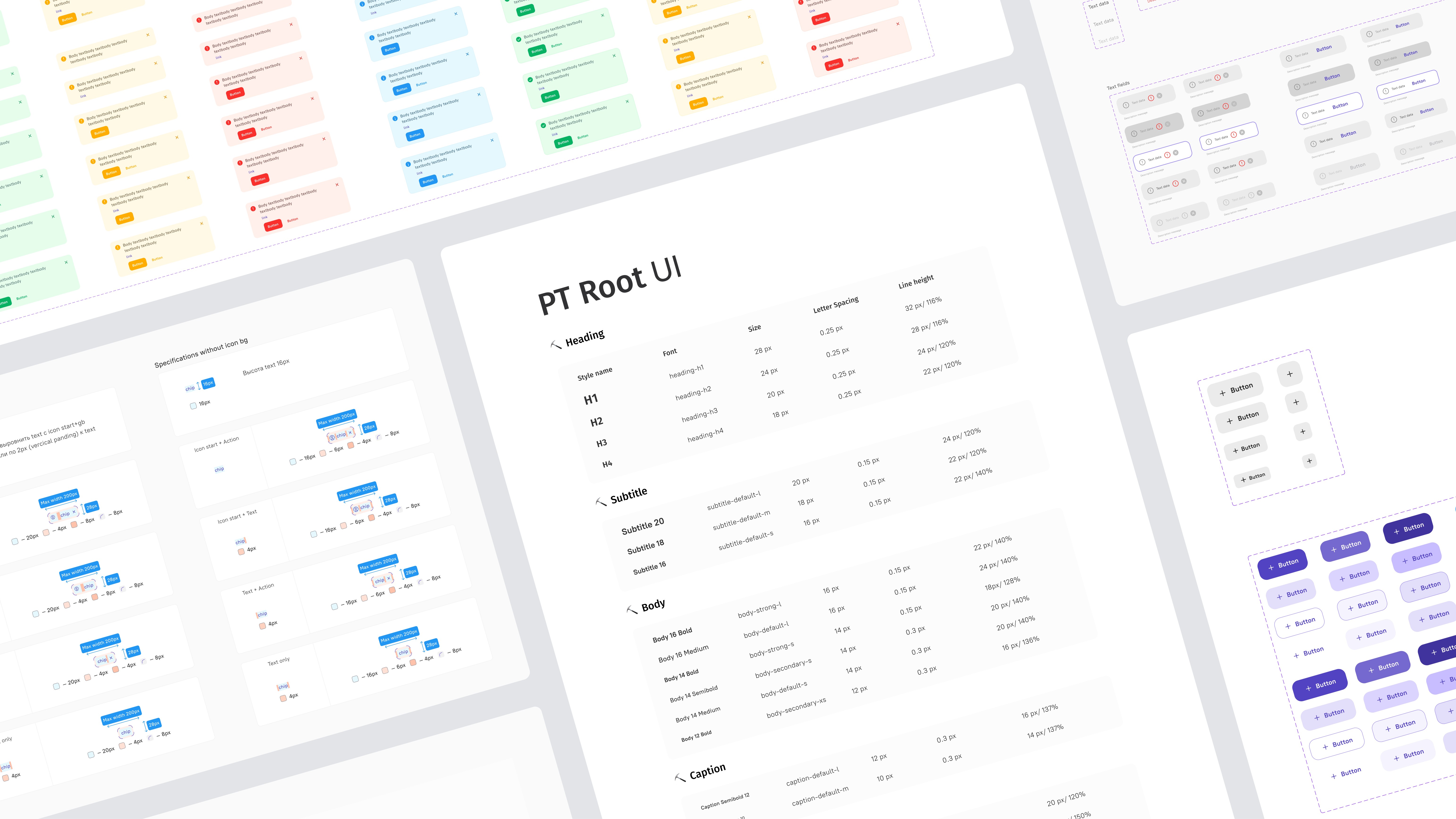
Established a single color, type, and spacing approach to keep visuals uniform
Created reusable components (tables, filters, modals, dashboards) for common workflows
Streamlined the design process so teams could focus on solving real problems instead of reinventing UI pieces
My Role
Audited more than 80 admin screens, finding and cataloging one-off patterns
Standardized styles in Figma, including the color palette, text styles, and spacing grid
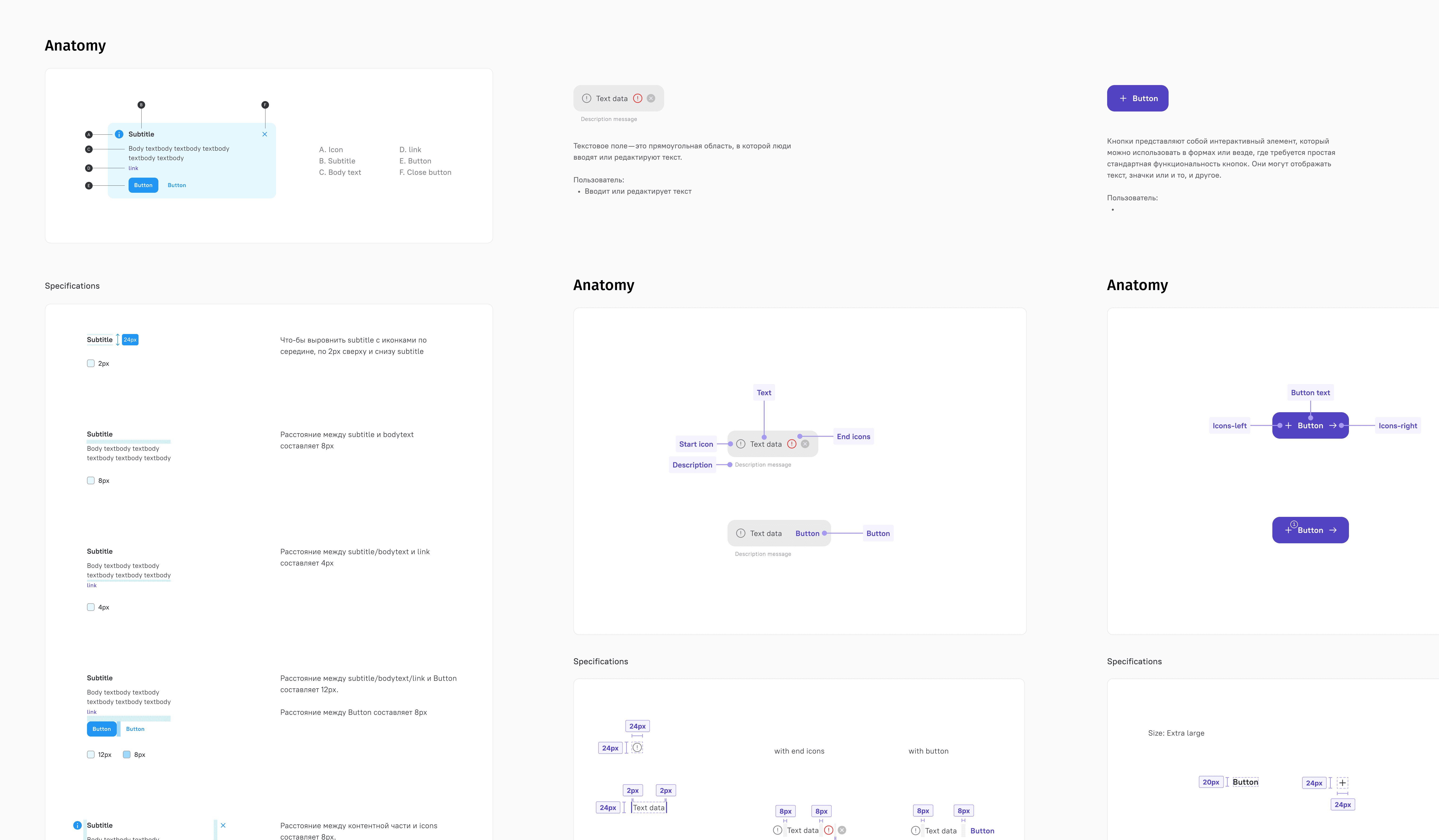
Built a component library with flexible variants and auto-layout
Documented each component’s use cases, states, and accessibility guidelines
/03 Research
Learning the Basics of Systems Design
When I started, I wasn’t sure how to organize each component. Apple’s and Google’s design systems are publicly available, so I used them as inspiration. They felt more like encyclopedias, though, great reference material, but not always easy to adapt. Implementing Atomic Design was the turning point: it gave me a clear blueprint for breaking down UI into atoms, molecules, and organisms.
Serving Both Designers and Developers
It soon became clear that the system had to work equally well for developers. I started writing thorough documentation that spelled out how each component should be used. This approach cut guesswork on both sides; designers knew which piece to grab, and developers understood the how and why behind each element.
/04
Process & Iteration
Each component was designed with optional states and flexible slots, so teams could add new features without overhauling existing work. Whenever the product evolved or Figma introduced new features, I updated the library, removed redundant parts, and expanded patterns to keep the system up to date.
/05
Impact
Admin screens now share a unified look and feel
Designers have a clear reference for choosing and using components, reducing friction
Developers pull production-ready pieces straight from the library, cutting down on back-and-forth
Delivery times dropped by roughly 30%, thanks to fewer design revisions and faster QA cycles
Teams could spend more time on user-facing innovations and less time rebuilding the basics
see also